Hello! I’m
Jakub Król
I’ve been creating graphics since 2017. What started as a hobby has become a passion I continuously develop. Since 2020, I’ve specialized in WEB/UI/UX design and run a business in this field. My work is characterized by a creative approach to each project and flexibility to client suggestions. I always aim for client satisfaction and involve them in the product creation process. I can also work effectively in teams, both remotely and on-site, as evidenced by my expanding experience.
Wykonuję grafiki od 2017 roku.
Z hobby stało się to moją pasją, którą stopniowo rozwijam. Specjalizuję się w WEB/UI/UX designie od 2020 roku. Moją pracę wyróżnia kreatywne podejście do każdego projektu i elastyczność wobec sugestii klientów. Zawsze staram się uzyskać najlepsze rozwiązanie dla grupy docelowej klienta, aby uzyskać najlepsze efekty pracy. Potrafię też działać w zespole, zdalnie i na miejscu, co potwierdza moje doświadczenie, które poszerzam.
WebXDesign
Cześć! Jestem
Jakub Król
Web/Ui/Ux
Graphic Designer
WebXDesign
Hello! I’m
Jakub Król
Web/Ui/Ux
Graphic Designer
I’ve been creating graphics since 2017. What started as a hobby has become a passion I continuously develop. Since 2020, I’ve specialized in WEB/UI/UX design and run a business in this field. My work is characterized by a creative approach to each project and flexibility to client suggestions. I always aim for client satisfaction and involve them in the product creation process. I can also work effectively in teams, both remotely and on-site, as evidenced by my expanding experience.


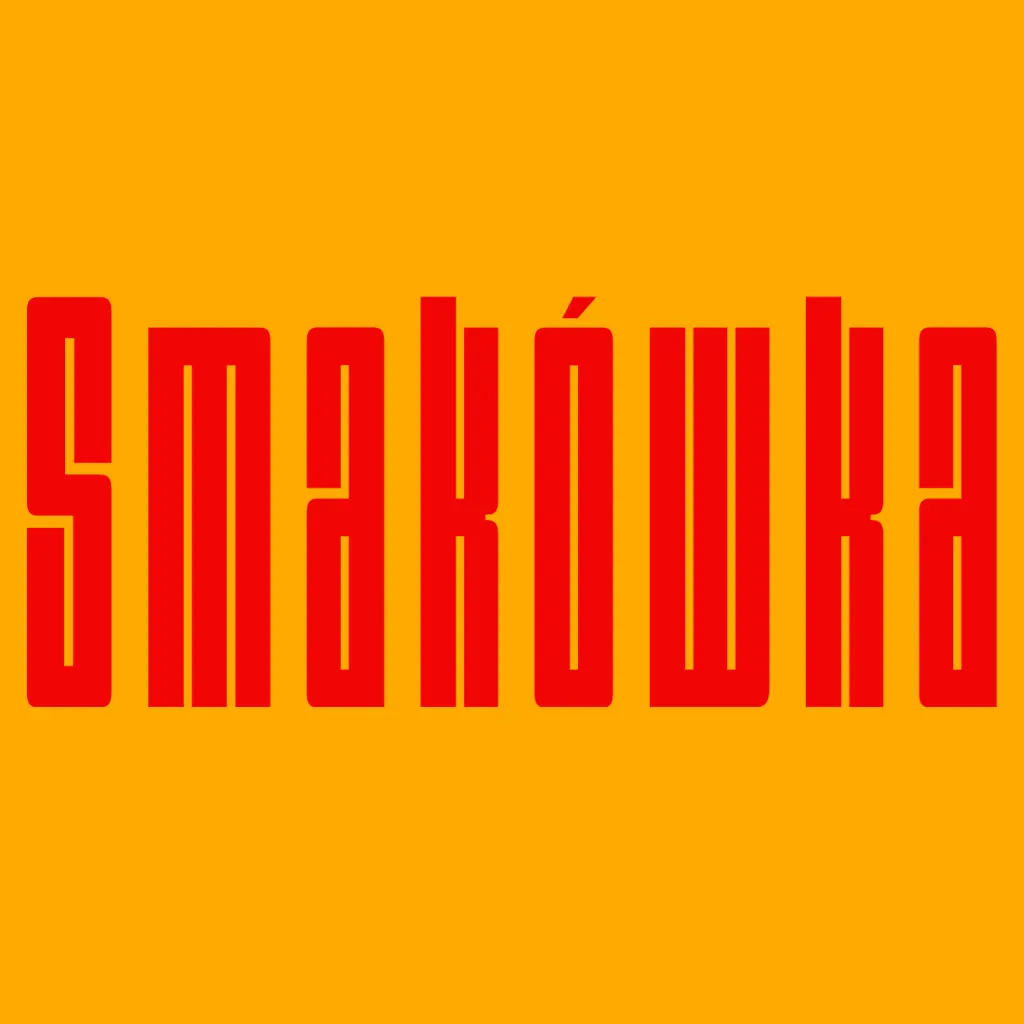
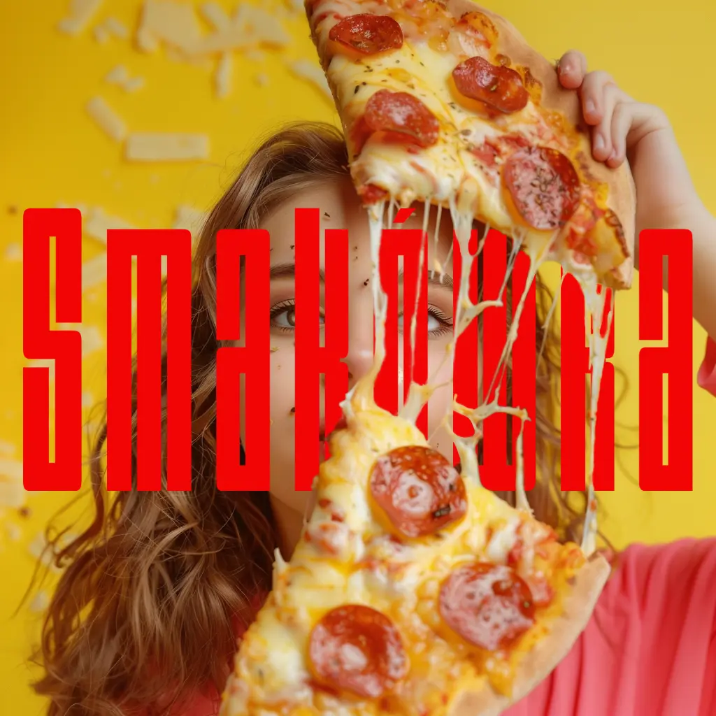
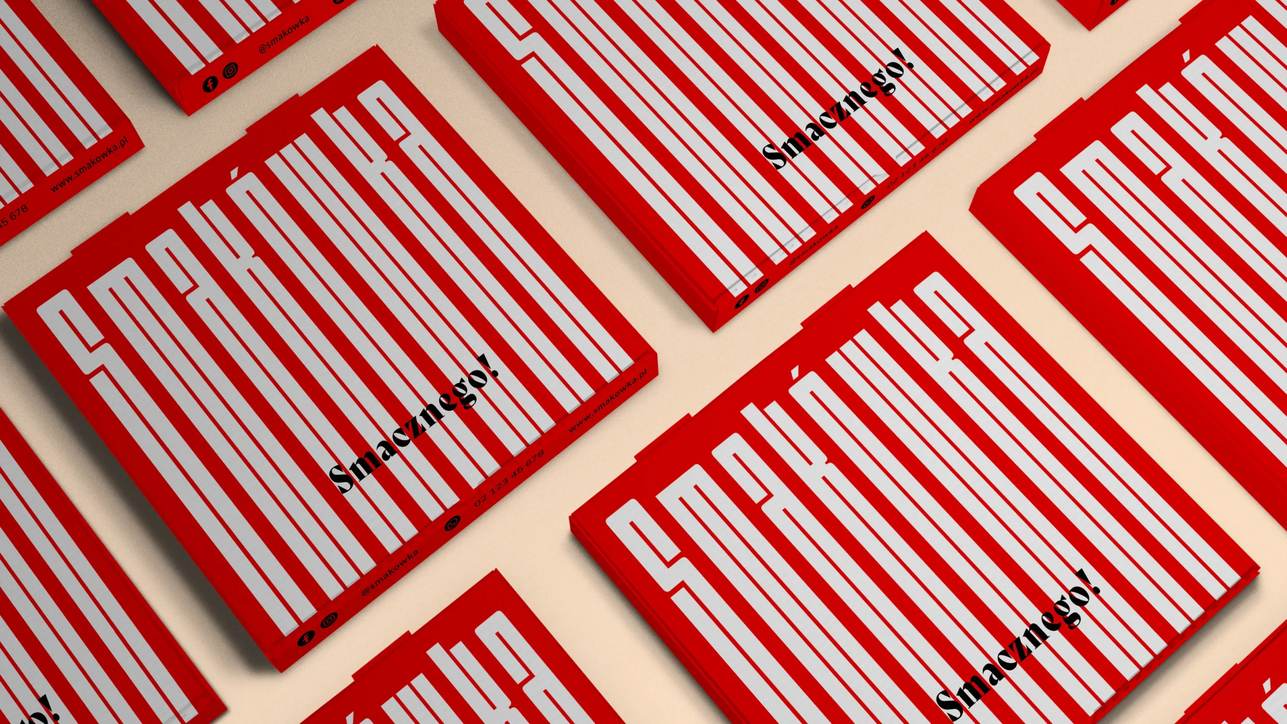
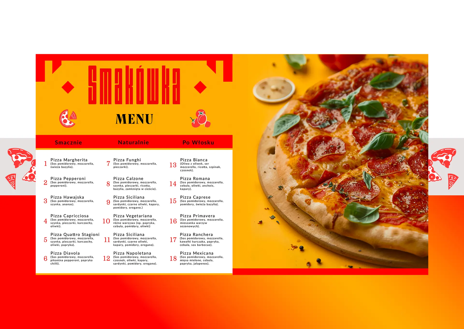
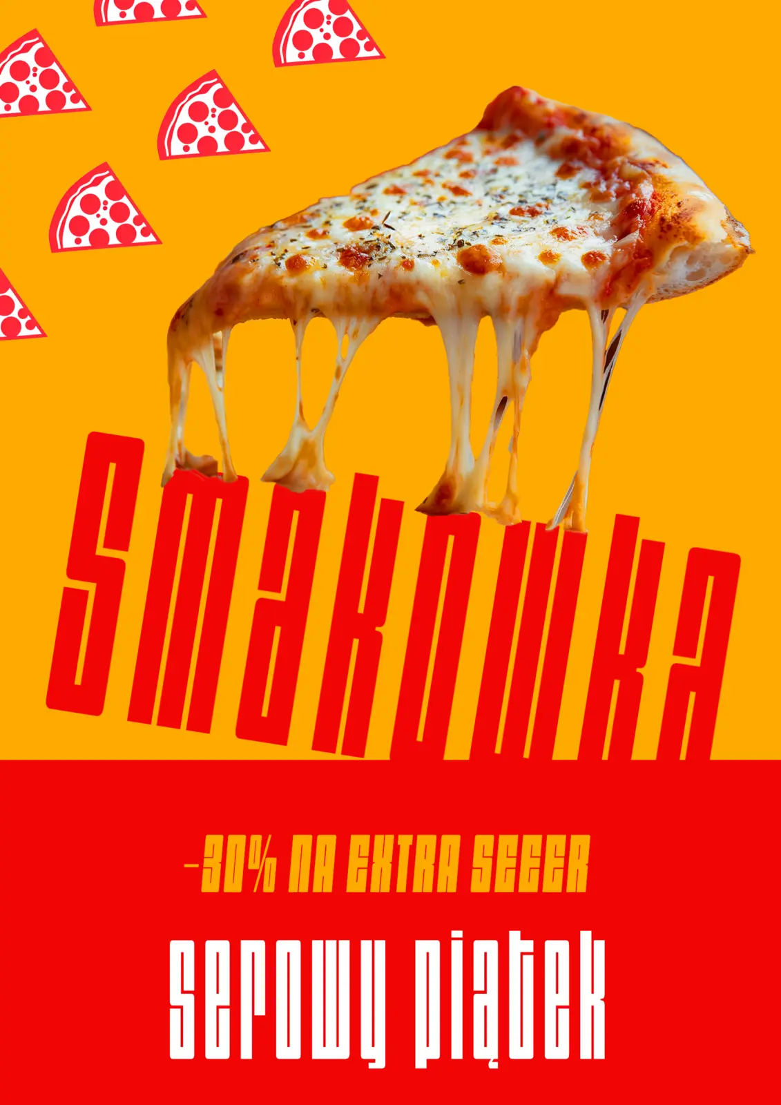
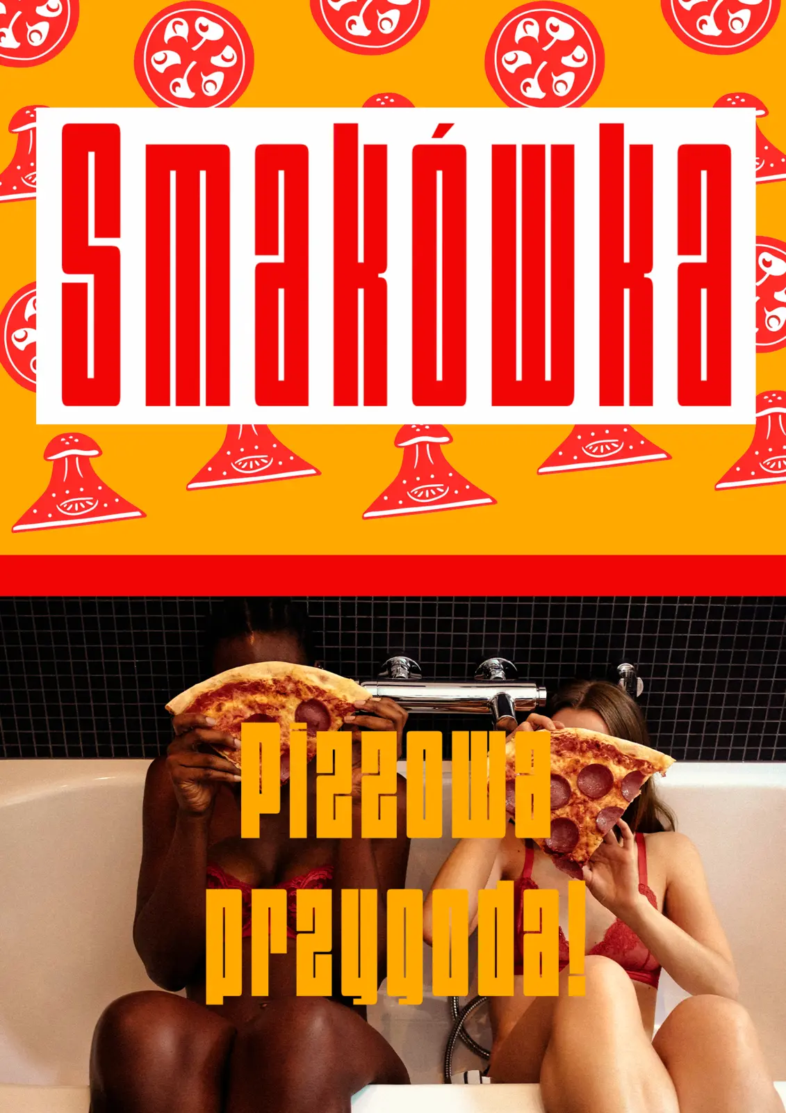
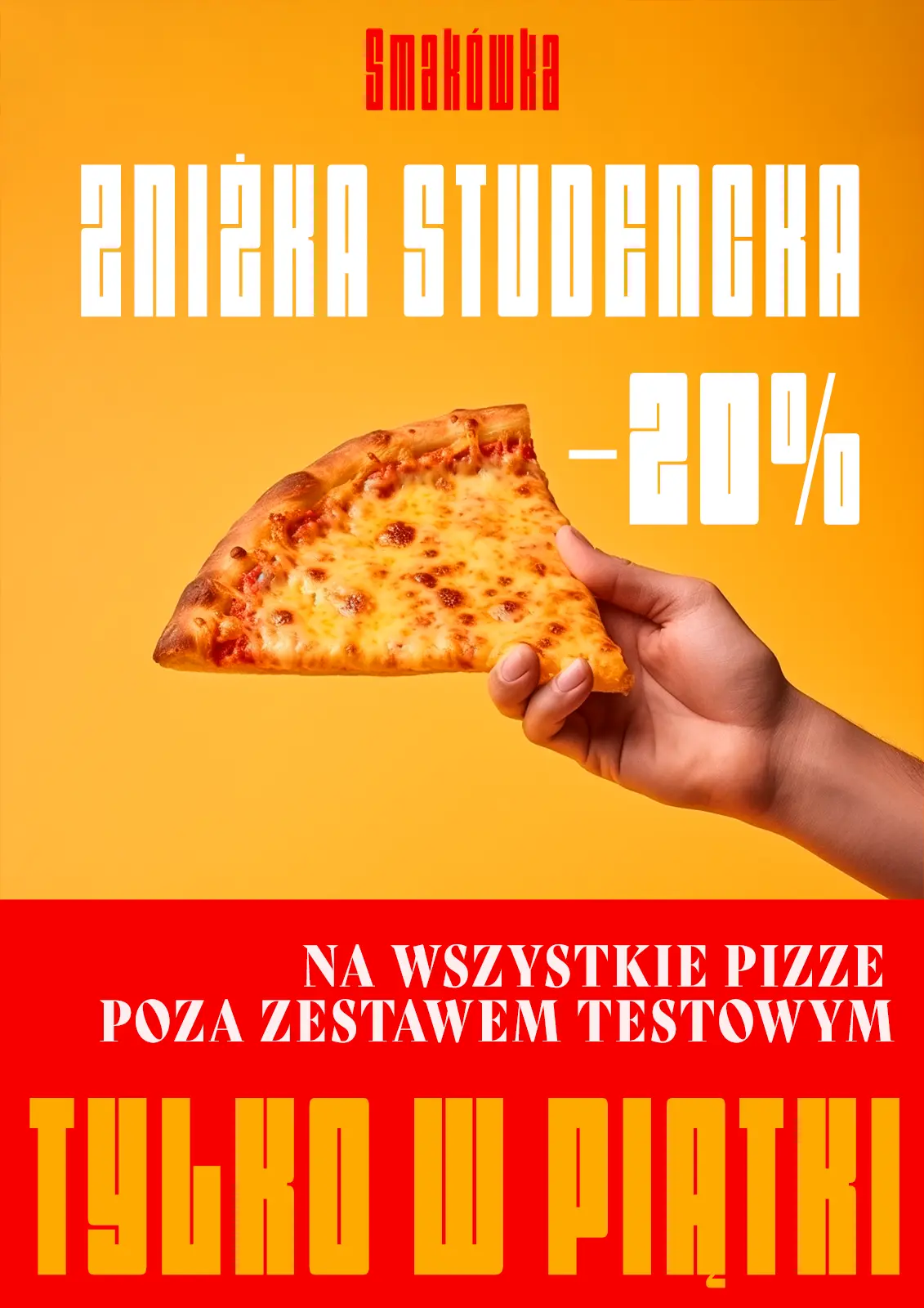
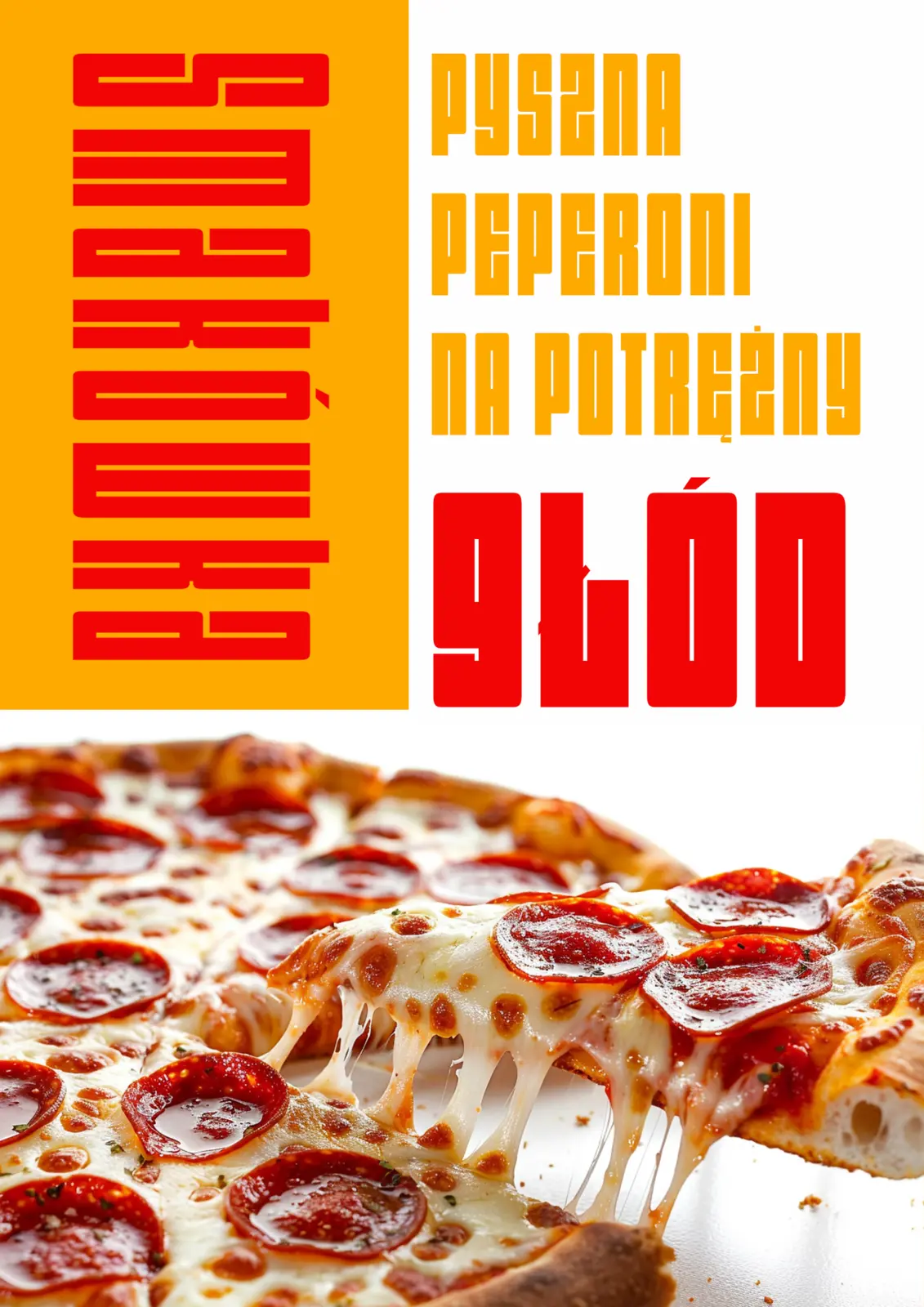
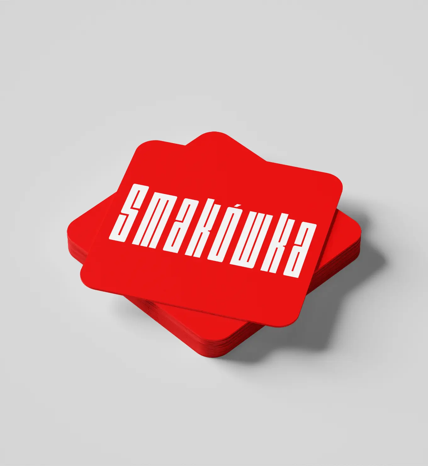
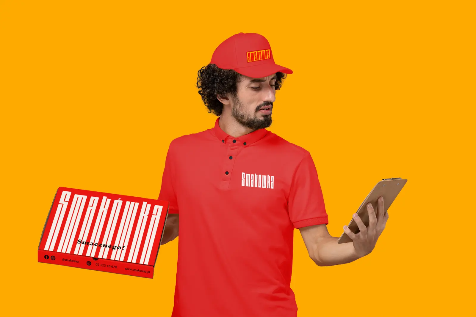
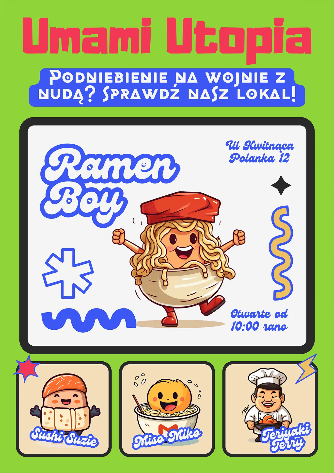
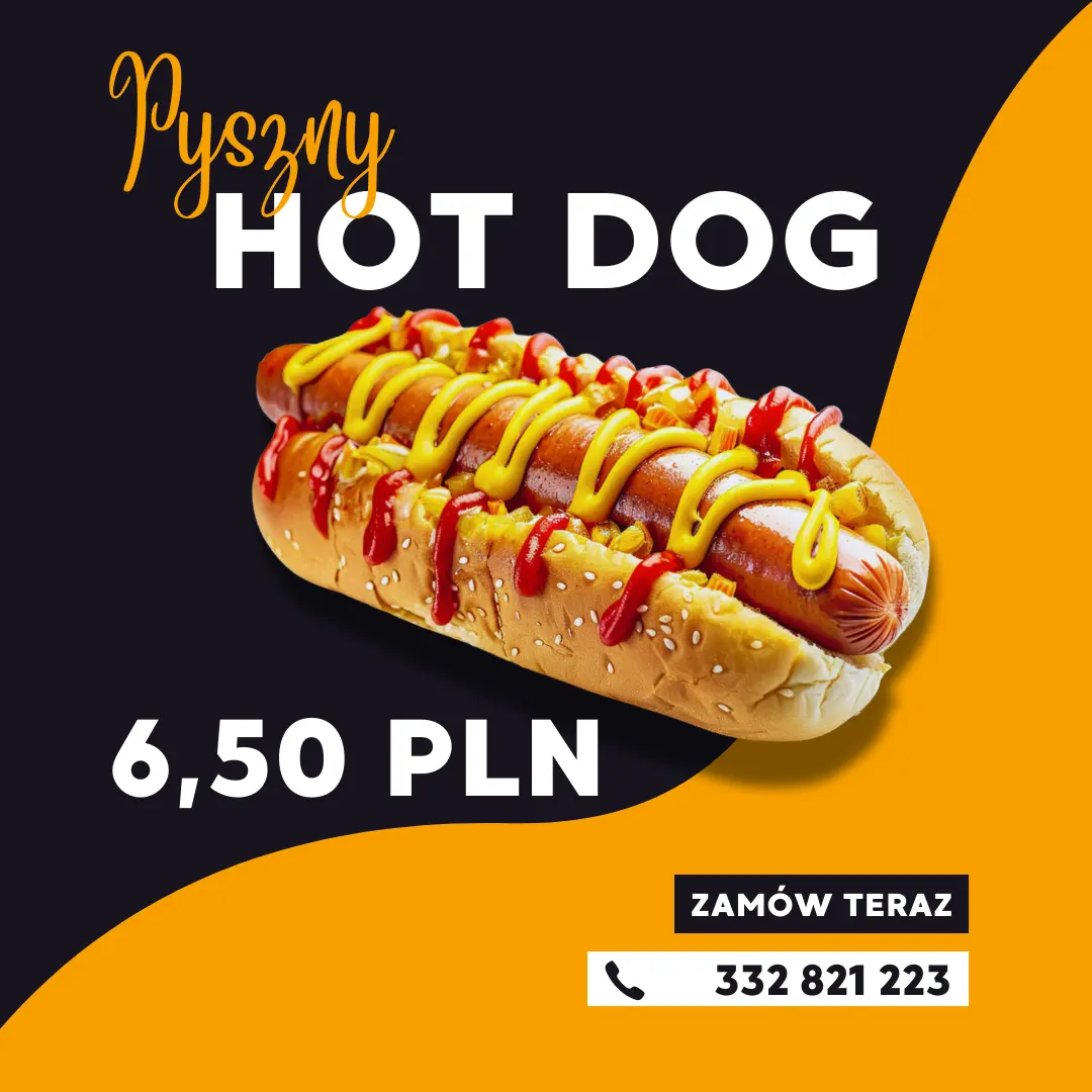
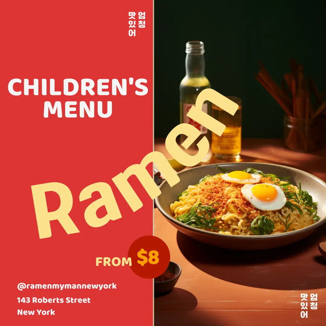
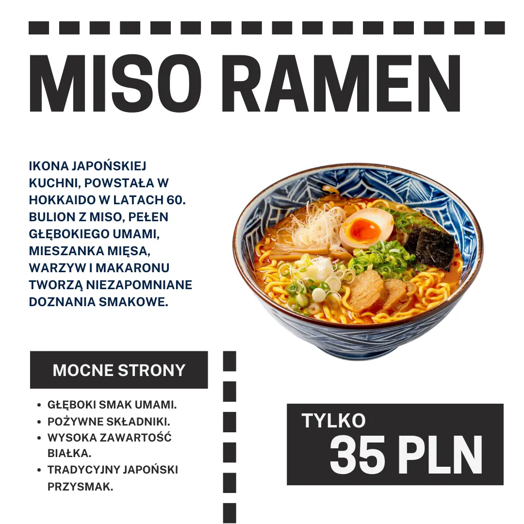
Smakówka
Logo
Website
Brand Design
Product Design
Art Drirection
Case Study

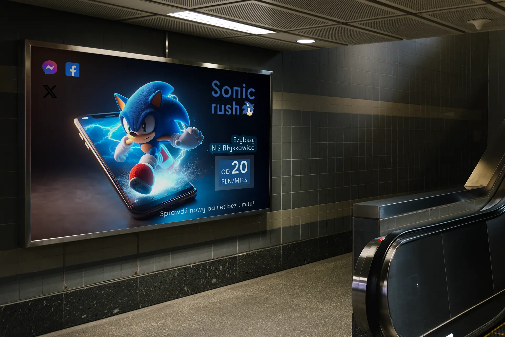
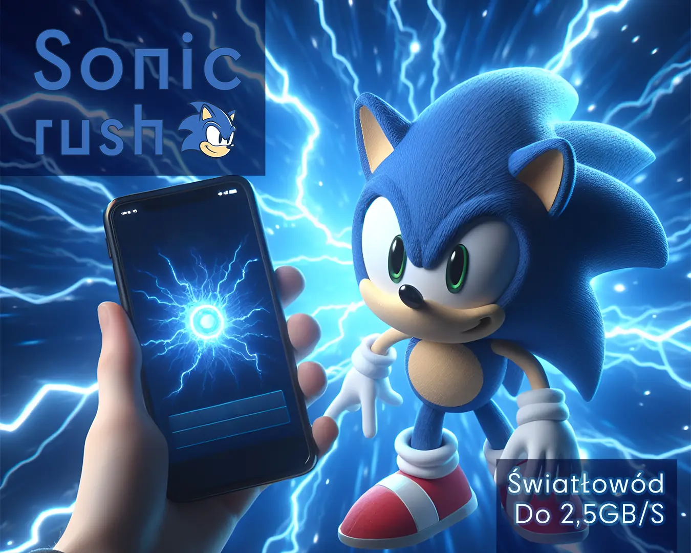
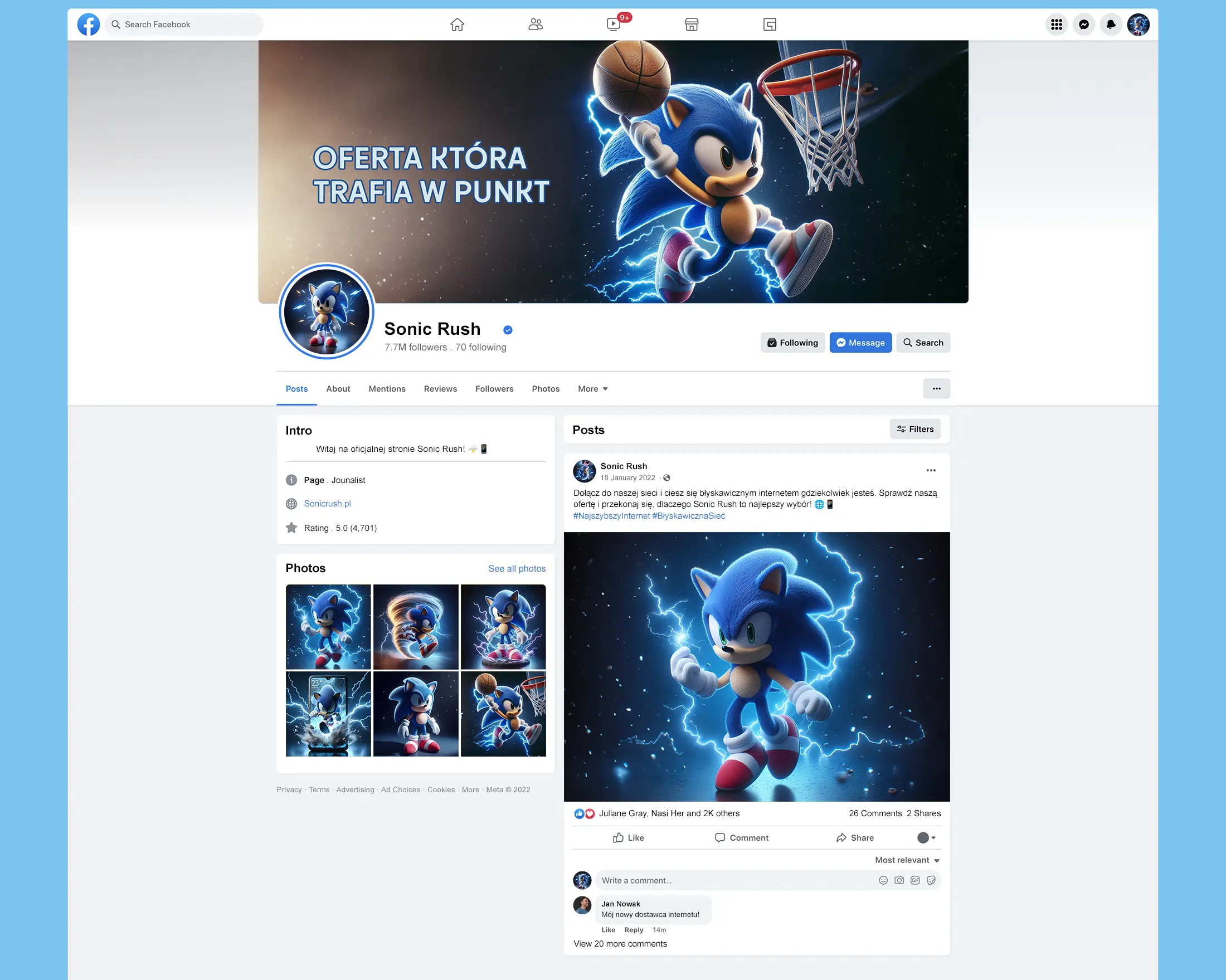
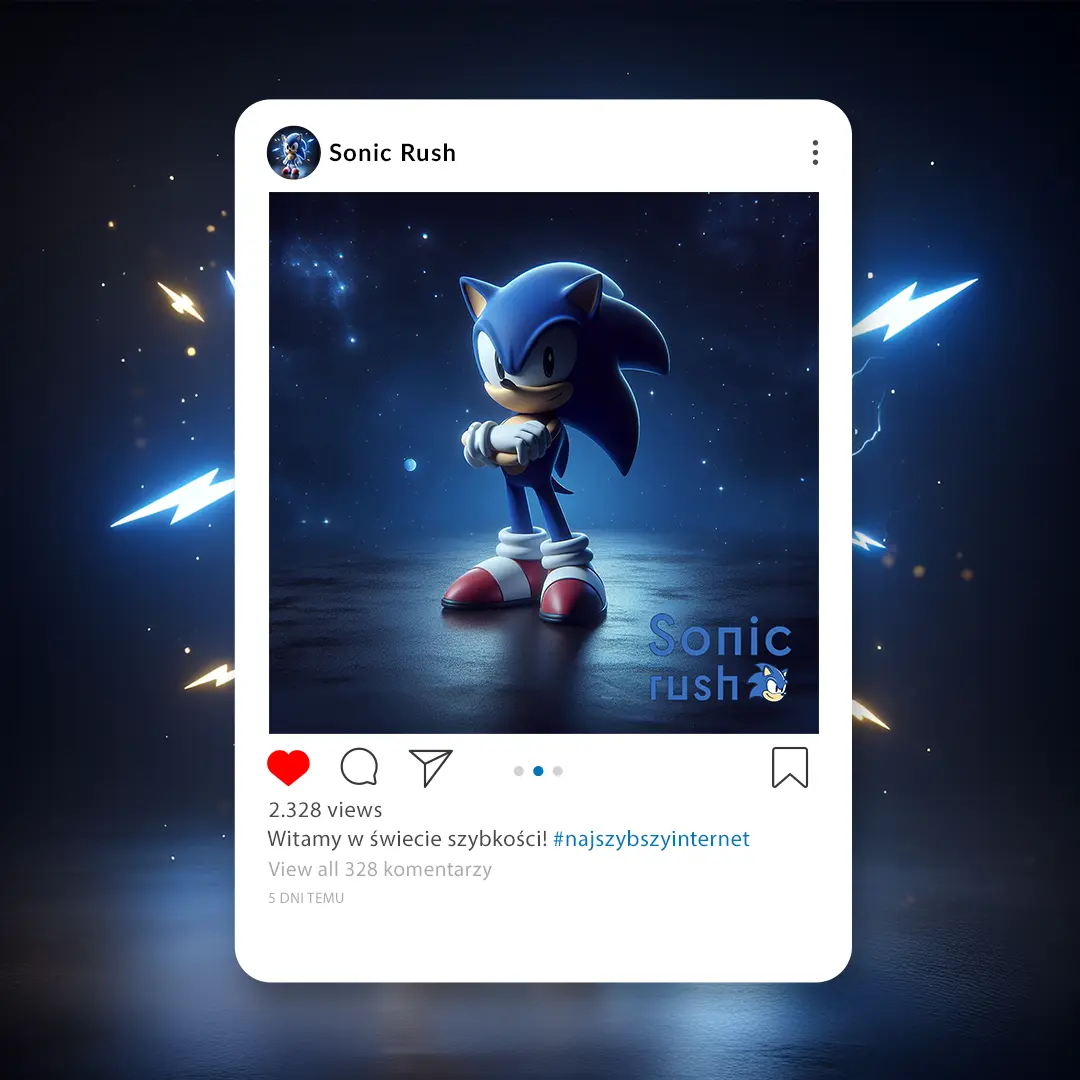
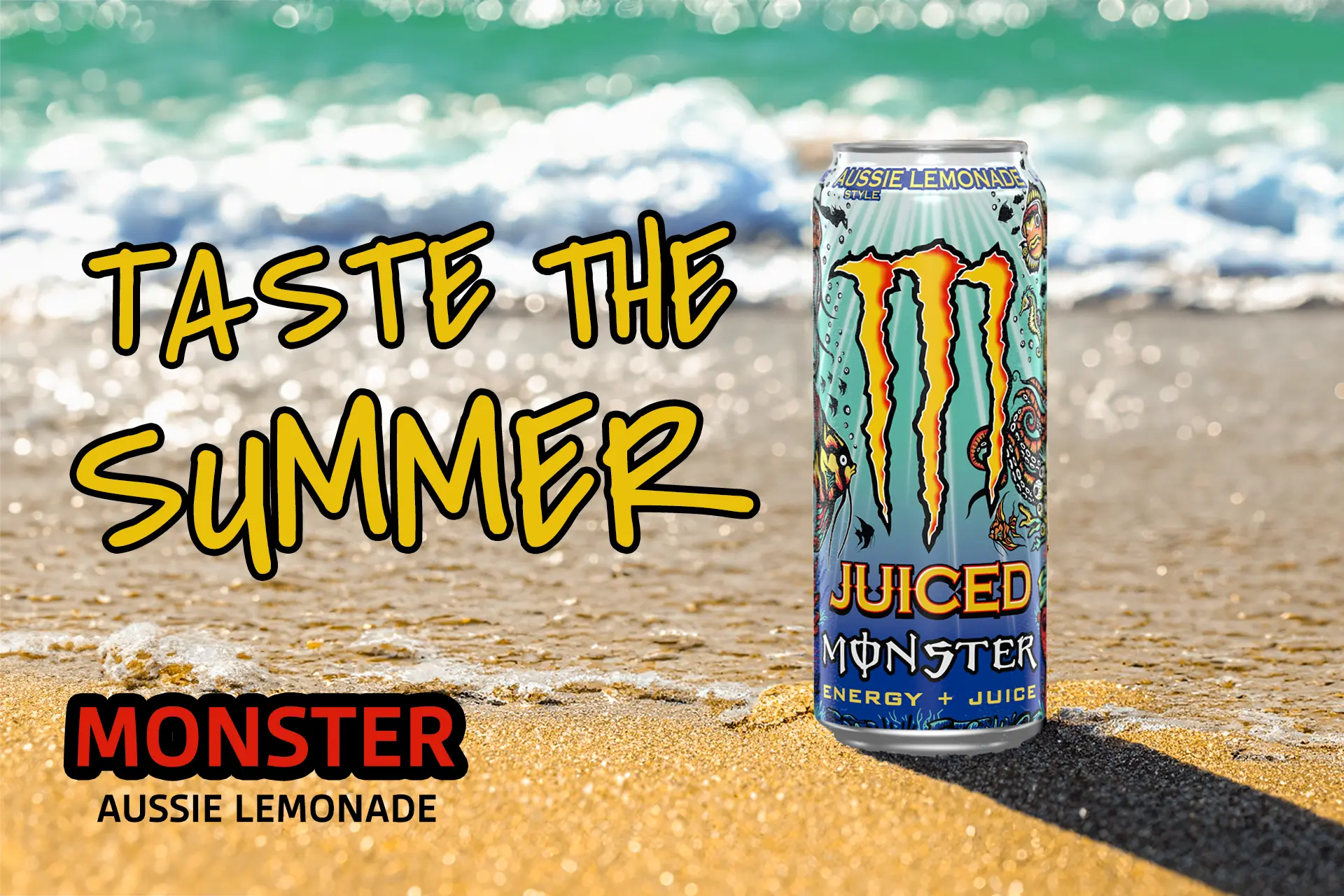
Sonic Rush
Logo
Website
Brand Design
Product Design
Art Drirection
Case Study

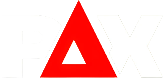
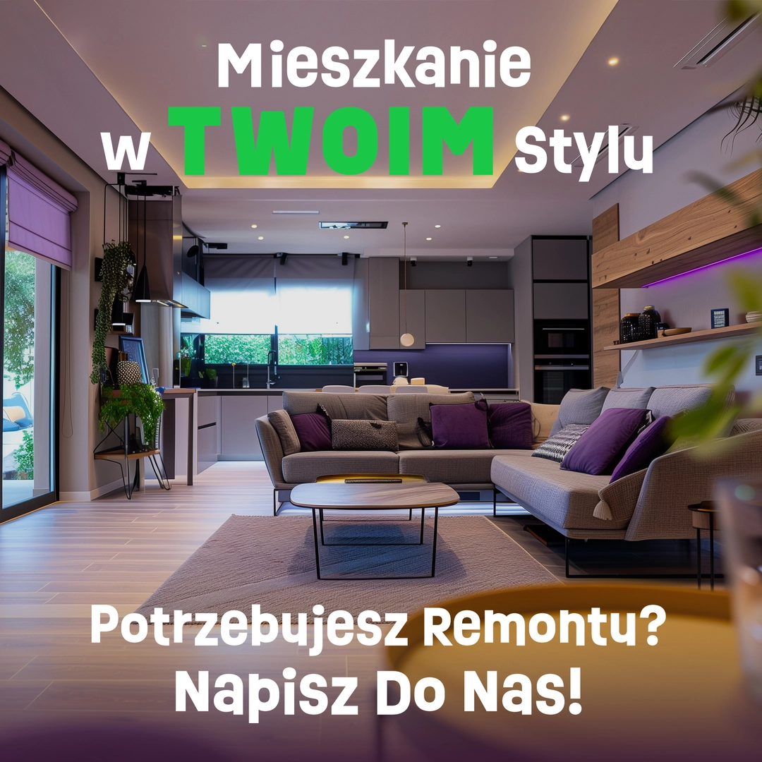
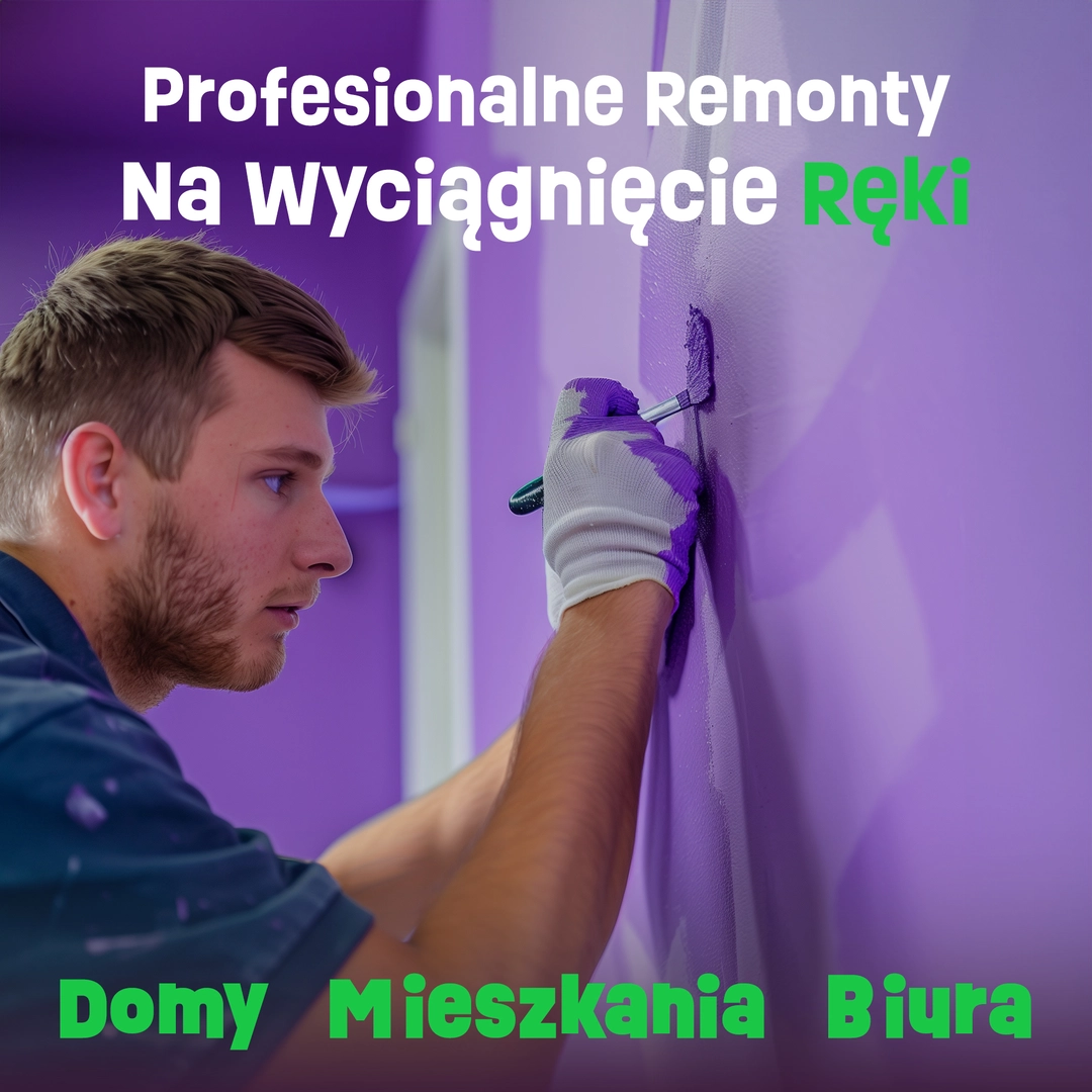
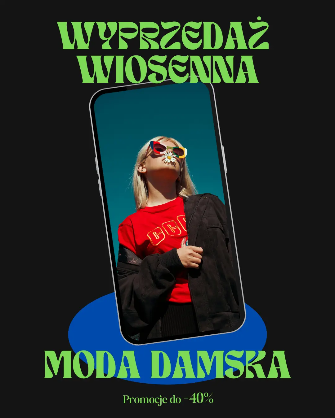
Pax Bags
Website
Technical Support
Store
Retouch

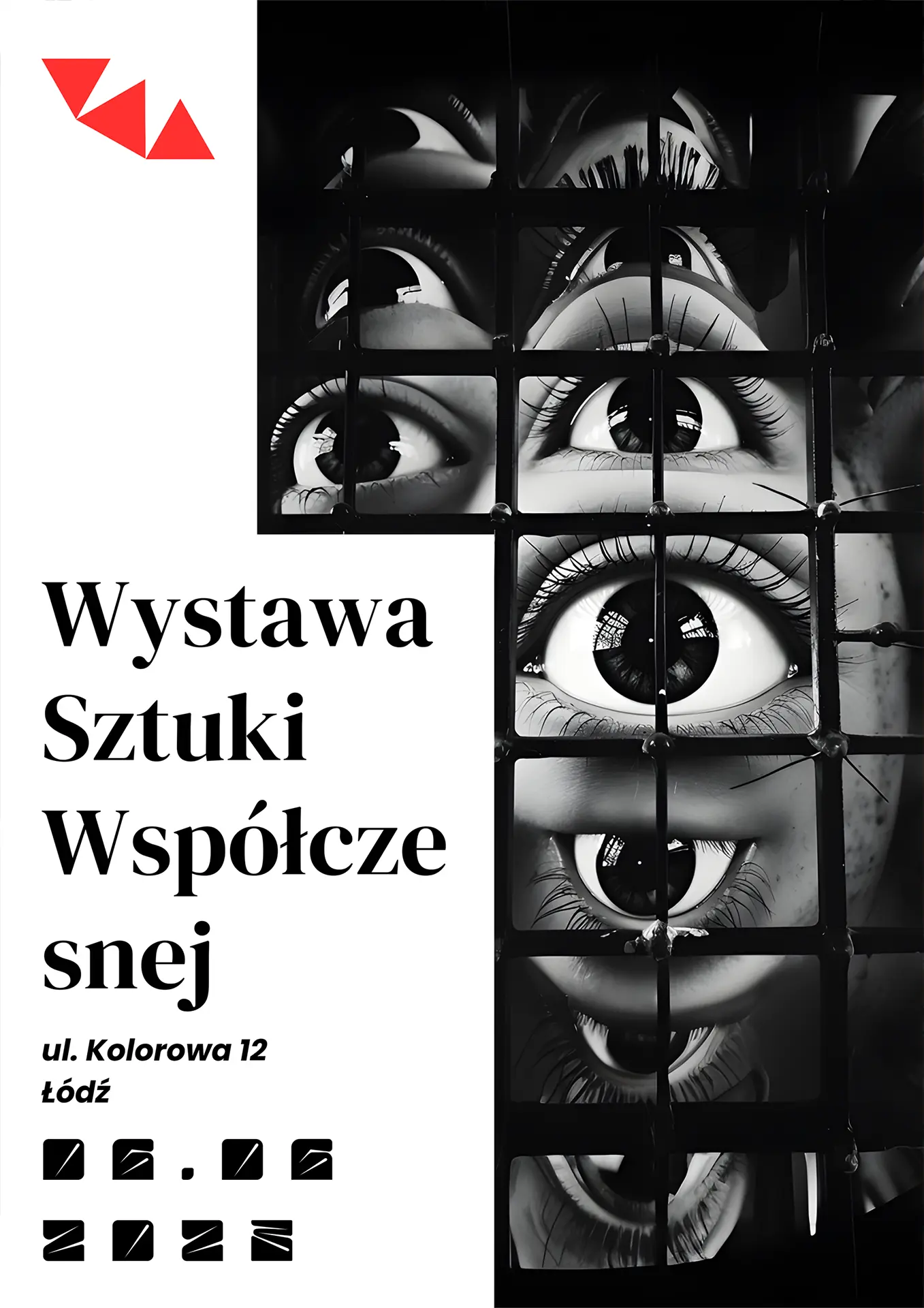
Hodowla Bengaleye
Logo
Website
Brand Design
Case Study

Fundacja Odnova
Website
Brand Design
Art Drirection


Sonic Rush
Logo
Website
Brand Design
Product Design
Art Drirection
Case Study

Pax Bags
Website
Store
Technical Support
Retouch
Hodowla Bengaleye
Logo
Website
Retouch
Art Drirection

Fundacja Odnova
Website
Brand Design
Art Drirection
FAQ
What is the project completion time?
The completion time depends on the project’s scale. A simple website can be ready in about 7 working days, while more advanced projects may take up to 21 working days.
Can the project be customized to my needs?
Yes, the project can be fully customized to your needs. It’s best to contact me beforehand to discuss details and adjust the budget accordingly. This way, we can plan the functionalities and aesthetics of the site to meet your expectations fully. Please contact me at:
What are the costs and additional fees?
Hosting costs depend on the chosen package on the Hostinger platform, and the domain cost is usually less than 25 € per year. The first year often includes significant promotions or is included in the price of medium or higher hosting packages.
What experience do you have in my industry?
I have experience creating many websites, with industry differences often relating to functionality expectations. I encourage you to contact me at contact@webxdesign.art to discuss project details.
Do you offer technical support after deployment?
Yes, I offer technical support after deployment, starting at 40 € gross per month. This service includes software updates and free support in case of site errors.
Skills
Infographics
Concept Design
Responsive Design
Brand Design
Print Design
Motion Design
Ads Design
Product Design
Wizualizacje
Image Retouch
Photo Manipulation
Product Photography
Website CMS
Online Store
Web & App Mockup
Website design
Local SEO
HTML & CSS Editing
Generating AI Images
Creating Content With AI
Figma
Framer
WordPress
Elementor
Adobe Photoshop
Adobe Illustrator
Adobe InDesign
Adobe Xd
Canva
Microsoft Office
Midjourney
Chat GPT
Framer
WordPress
Elementor
Adobe Photoshop
Adobe Illustrator
Adobe InDesign
Adobe Xd
Canva
Microsoft Office
Midjourney
Chat GPT
Education & Experience
📷
Internship at a Photography Studio
During the internship, I made many graphic corrections, participated in studio photo sessions, sometimes as a photographer, and performed photo editing.
💻
Internship at a Creative Agency
During my internship, I worked with professional graphic designers and participated in creating graphic designs for websites and physical materials, including social media graphics, infographics, leaflets, and billboards.
📚
Technical High School with a Graphic Design Profile
Four years of preparation and learning to become a digital graphics and printing technician, completed with a passed exam for a high school diploma.
👨🎓
Marketing & Sales Studies
I began studies in marketing and sales, convinced that growth in this area is key to the dynamic world of business. My previous experience as a graphic designer and running my own design company highlights creativity and flexibility. I want to develop by acquiring new skills in this new phase.
🖥️
Starting My Own Business
I professionally create websites, online stores, as well as logos, infographics, and other graphic materials according to the needs of individual clients and companies.
I create AI-generated images on Adobe Stock.
Mission
WebXDesign aims to support the revolution in web design. Specializing in WEB/UI/UX design since 2020, I create modern, functional websites reflecting the spirit and standards of the 21st century. My mission is to rejuvenate the look of Polish and global internet spaces, transforming them into user-friendly environments. I prioritize creativity, flexibility, and client involvement to craft products that not only impress aesthetically but also provide unforgettable user experiences. My designs represent brands online, conveying their essence in the most visually appealing way, without unnecessary text.
If you’re interested in collaborating, I encourage you to schedule a free consultation!